Long Shadow – The updated flat design?
In the past few weeks there is a new design trend started to grow: Long Shadow (no, not the DC character). Designers are trying to use it, some people just simpy hate it. Why? Becase it is new, because it is easily misused.
With the launch of Windows 8, flat design became the mainstream: in the web or in the print design graphics professionals like to use it. And with the iOS7 Apple started to use it too. Why is the flat design good? It looks simpler and has less distraction, lets you focus on the ipmortant content.
But flat design alone is not enough as we can see because a new trend is in the grow: Long Shadow. The mkain principle is simple: the shadow extends at an approximately 45-degree angle and has the size 2.54 size of the main object. It gives a real depth feeling for the main object but maintains the flat look.
It can be very nice if used correctly, but sometimes people misuse it: You can’t apply Long Shadow for every object. It has to be flat, it has to be simple and use a few colors. Can’t use it on very complex object or 3D icons, because int hat case it looks awful.
Let’s see a few good examples with the Long Shadow approach:
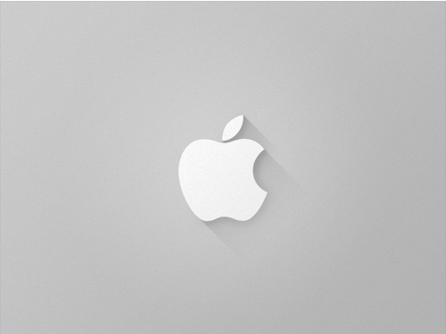
Apple Logo by Eldin Heric.
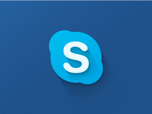
Skype by JustD.
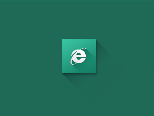
Internet Explorer by Thomas Snop.